Utility Upgrades: Behind the Look with Kal
June 16, 2021
Behind the scenes, the Bear Hub staff works hard to spin out content for our readers to enjoy, including anything from larger news to personal feelings. In particular, the editors work as second-in-command to the supervisors, holding them and their peers to higher standards. Thusly the editors were tasked with putting heads together to help the site grow and evolve, in whatever ways that statement could be interpreted. The question hung heavy: what would your legacy be? Some projects took the form of seeking competitions in which to show off the year’s best work. Another manifested in efforts to further Bear Hub’s publicity reach in the school. Altogether each editor had their work cut out for them.
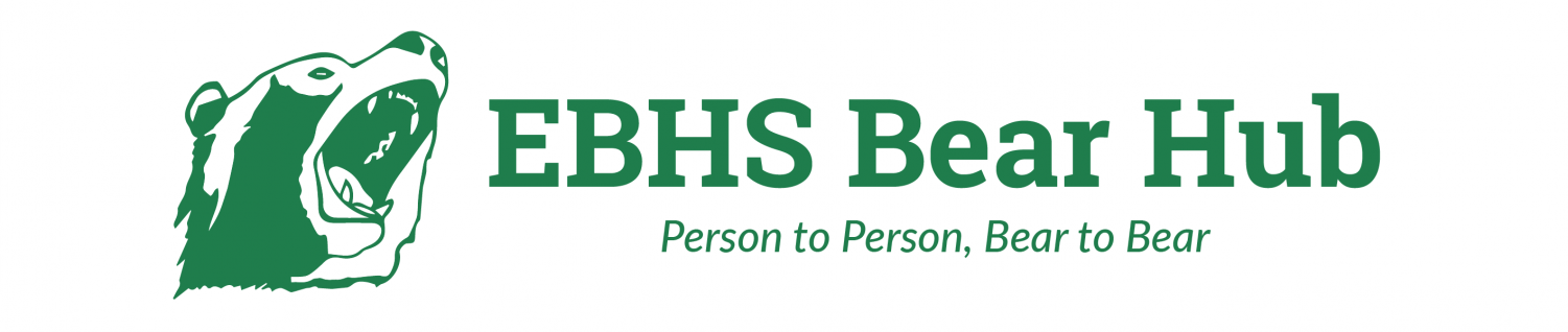
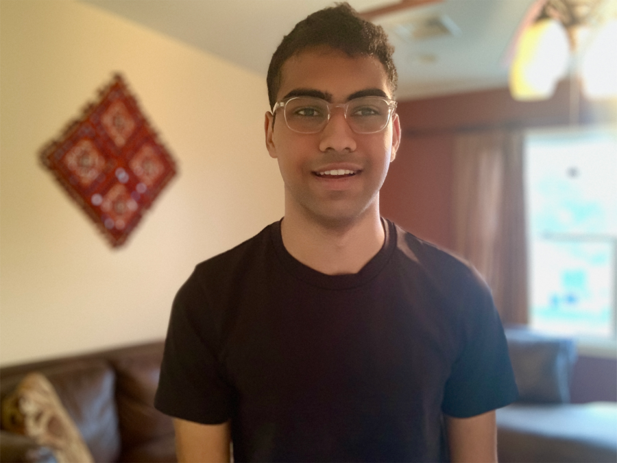
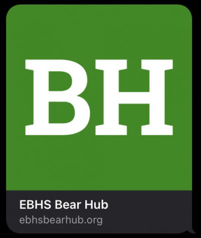
Here I interview Kal Pandit, the talented editor responsible for Bear Hub’s clean new look- any previous patrons of the site can put to name the differing color scheme and logo. Here is insight into his thought processes while making change happen.
Q: WHAT SPECIFICALLY INSPIRED YOU TO MOVE TOWARDS A SITE REDESIGN?
A: The real answer is because one of the competitions we were hoping to do required us to make significant changes to the website. However, I wanted to make the website look cleaner and more intuitive, so it doesn’t feel like so much is coming at you all at once. Sometimes, it felt like there were way too many colors popping out at me and trying to gain my attention, so I hoped to reduce that. And lastly, I took a look at some other newspapers that use the same platform we do — I learned that the best sites had simple, easy-to-follow interfaces, and I aimed to recreate one for Bear Hub.
Q: WHAT FACTORS DID YOU TAKE INTO CONSIDERATION AND CHANGE?
A: One goal I had was to make the website have a simpler color scheme. The competition limited us to three colors, so I had to change it by creating a green and white color scheme. I also wanted to make everything look more consistent — there were white boxes against a black background, so I changed it to white-on-white. And I recognized that we had to be mobile-friendly. I realized this by accident, but if you share an article through text message, you’ll see a Bear Hub icon with it.
Q: HAVE YOU HAD PRIOR EXPERIENCE WITH WEBSITE DESIGN?
A: No, this was basically my first time with a real site! I fiddled around with the design and even broke the website a few times. With a tool like Google Sites, it’s incredibly easy to make a site. The options are laid out for you. However, beyond SNO Sites (the platform on which we create our stories), we use a platform called WordPress — it’s really flexible, and companies like the BBC and CNN use it for their sites. So evidently it’s much harder!
Q: WHAT TOOLS DID YOU UTILIZE?
A: I used the design tools within SNO Sites to give our website the facelift you see now. I could see the changes in real time as I was making them, which helped me avoid breaking the website. Sometimes, at least.
Q: DO YOU THINK YOU’LL GET TO DO SOMETHING LIKE THIS AGAIN IN YOUR CAREER?
A: Maybe! I’m a computer science major, but I’m undecided as to which specific part of computer science I’ll explore. Design certainly isn’t out of the question, though, and I might even be able to do things like this on a larger scale. There’s a whole discipline centered around studying and creating user interfaces. That could be interesting!
So there you have it- the tools that Kal used were straightforward, and with a little elbow grease and consideration did he leave his own legacy on Bear Hub. Though it was not his first goal, it became his most evident accomplishment! Future browsers of Bear Hub’s site will find the experience even better than before, as new generations of staff and editors continuously improve its plethora of content.